Living on the Grid
I’ll use the 9-panel grid throughout EXIT CITY… but with an intriguing variation.

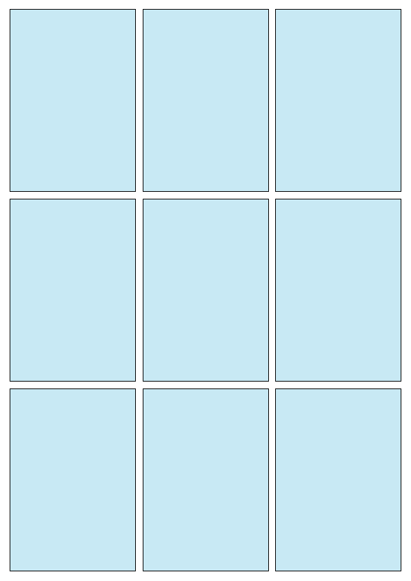
Graphic designers of all kinds (print, web, product, etc.) use different kinds of grid-based layouts to organize their designs. Comics creators also embrace grids as scaffolds to structure complex visual ideas, most notably with the “9-panel grid:”
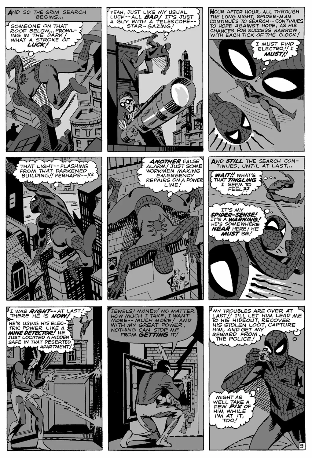
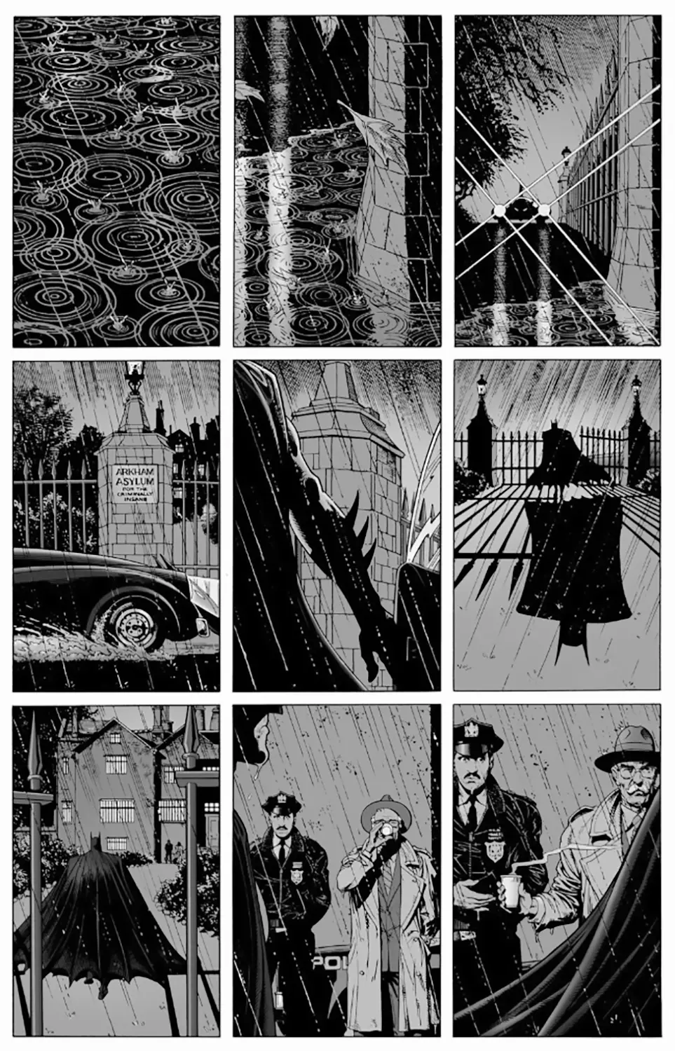
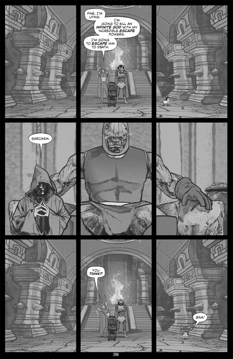
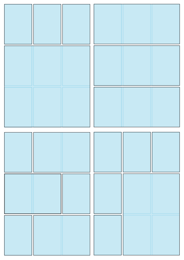
“The rule of thirds” divides the height and width of the page, resulting in a grid of nine equal panels, each proportional to the original page size. As the artists above demonstrate, a single simple format can deliver a wide range of story moods and pacing. Additionally, the grid can serve as the framework for other panel combinations:
Like most good visual formulas, I think the 9-panel grid helps keep things cohesive and organized while offering a remarkable amount of flexibility. I’ll therefore use the 9-panel grid throughout EXIT CITY… but with an intriguing variation: each part of the story will begin as a grid-based “page,” but will also be broken apart and arranged for scrolling, webcomic-style viewing.
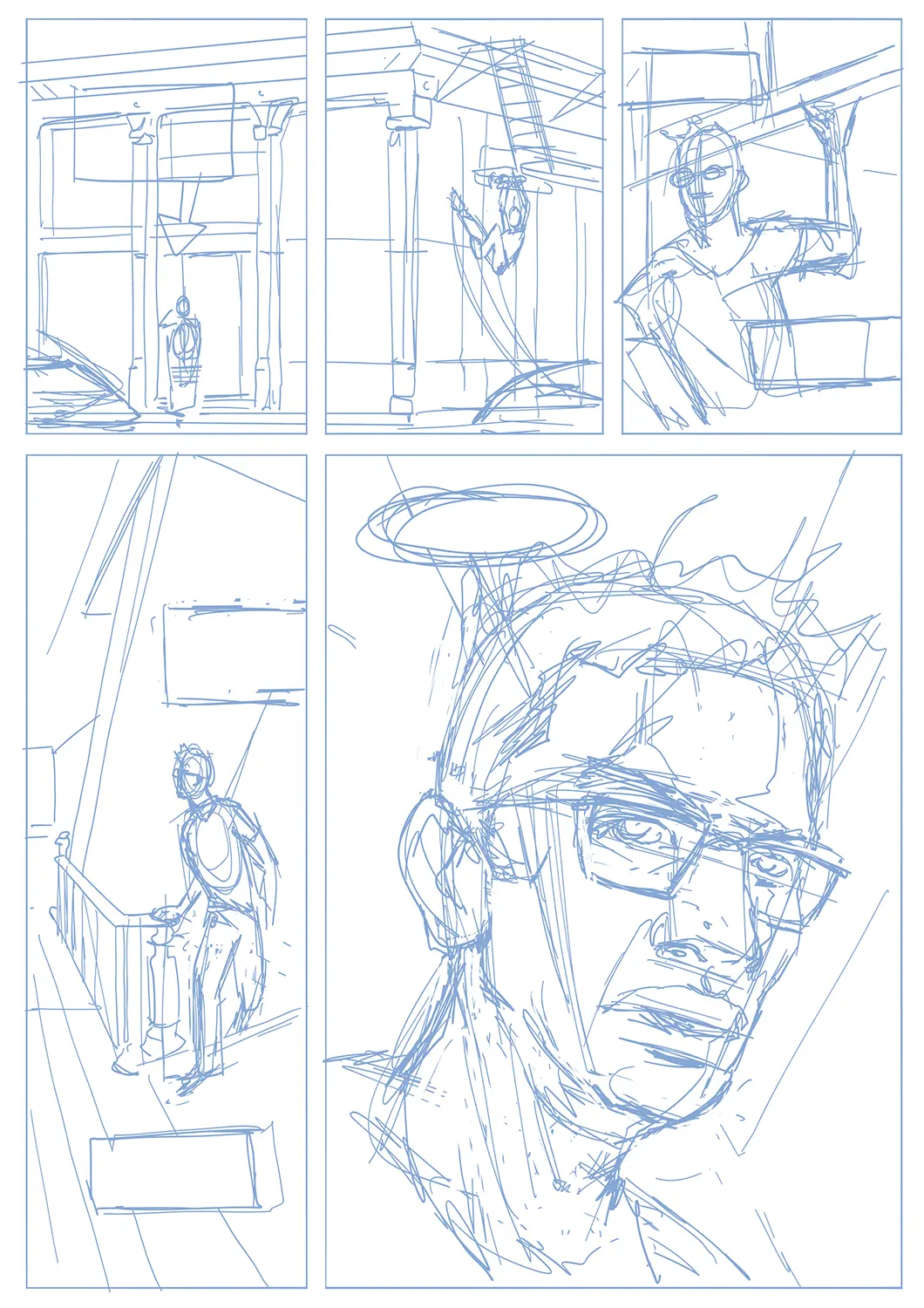
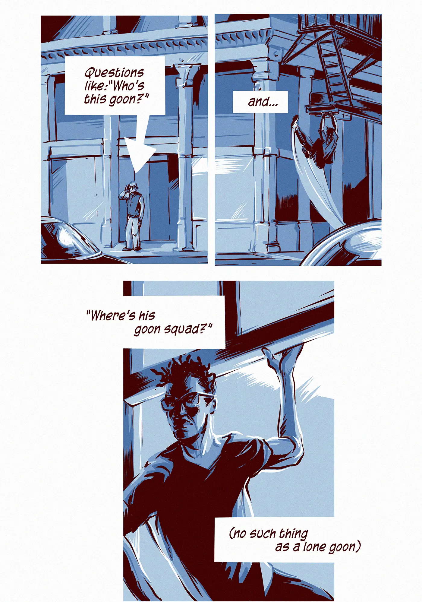
For example…here’s a breakdown for one of the pages from the EXIT CITY prelude. I roughed out the five panels in Adobe Fresco using a nine-panel grid…
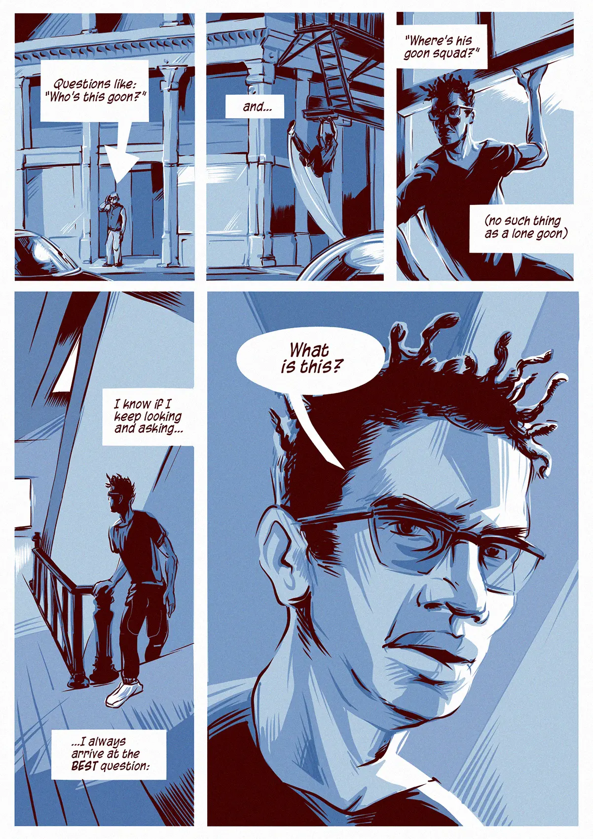
…then worked up each panel in Adobe Illustrator. As a printed page, it would look something like this:
But since using Illustrator guarantees that each panel is a resizable vector-based unit, I can reconfigure those units into something better suited for scrolling:
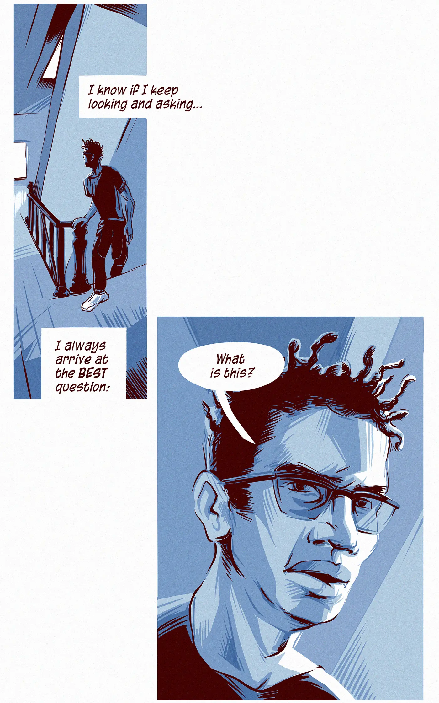
I’m excited about designing episodes of EXIT CITY to fit both formats. If each page is a song, the webcomic version will be its “remix” — same key elements, slightly different arrangement.